

Why a statement wall can miss the mark
A statement wall only works when it suits the room it sits in. If the scale is wrong, the colour is too loud for the light, or the panel pattern has nowhere to breathe, the whole space starts feeling crowded instead of considered. In Cape Town homes with open-plan living areas, we often see one wall treated in isolation while the rest of the room is ignored, and that is where the trouble starts.
The best results come from matching the wall to the room’s purpose. A lounge in Somerset West with soft natural light needs a different finish to a reception area in Montague Gardens that must handle daily traffic, cleaning and heavier wear. When the wall is chosen properly, it can add structure, warmth and even help with noise. When it is not, it can look forced within days.
Choosing a scale that fits the room
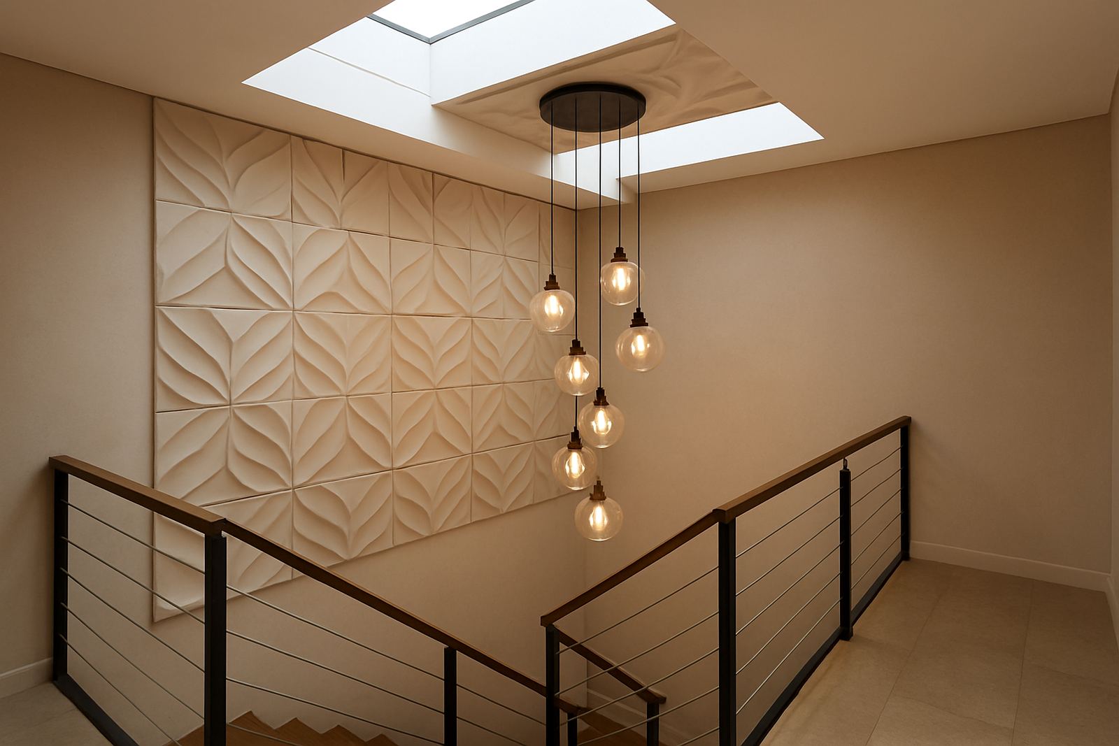
One of the biggest mistakes is using panels that are too small for a wide wall, or too busy for a compact room. In a narrow passage or small apartment bedroom, repeated detail can make the room feel tighter than it is. In a larger boardroom or double-volume foyer, a tiny pattern can disappear from a distance and lose its impact.
- Measure the full wall, not just the middle section you notice first.
- Check viewing distance from sofas, reception counters or dining tables.
- Allow for plugs, switches, skirtings and cornices before deciding on layout.
- Use a sample or mock-up where possible so the proportions make sense.
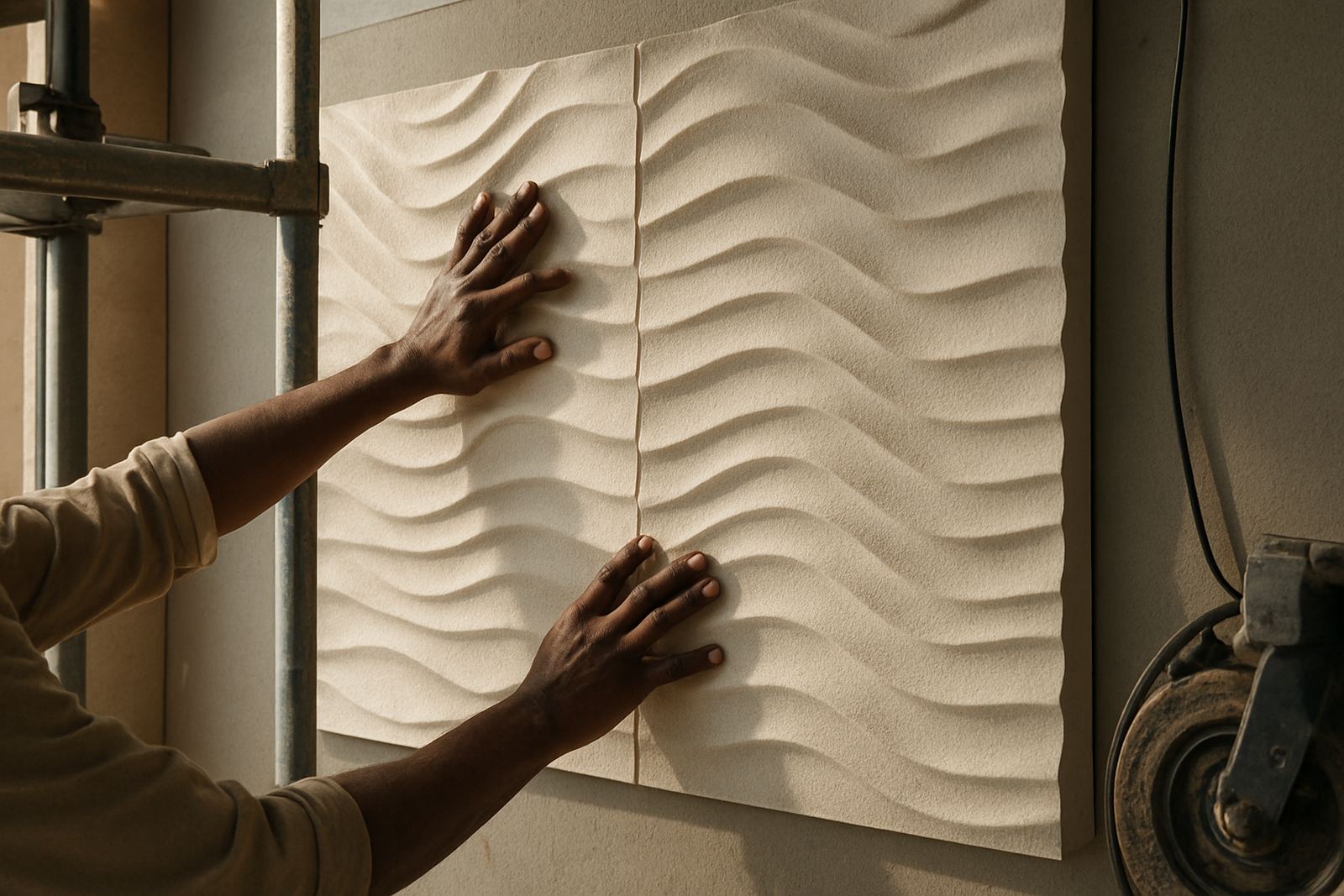
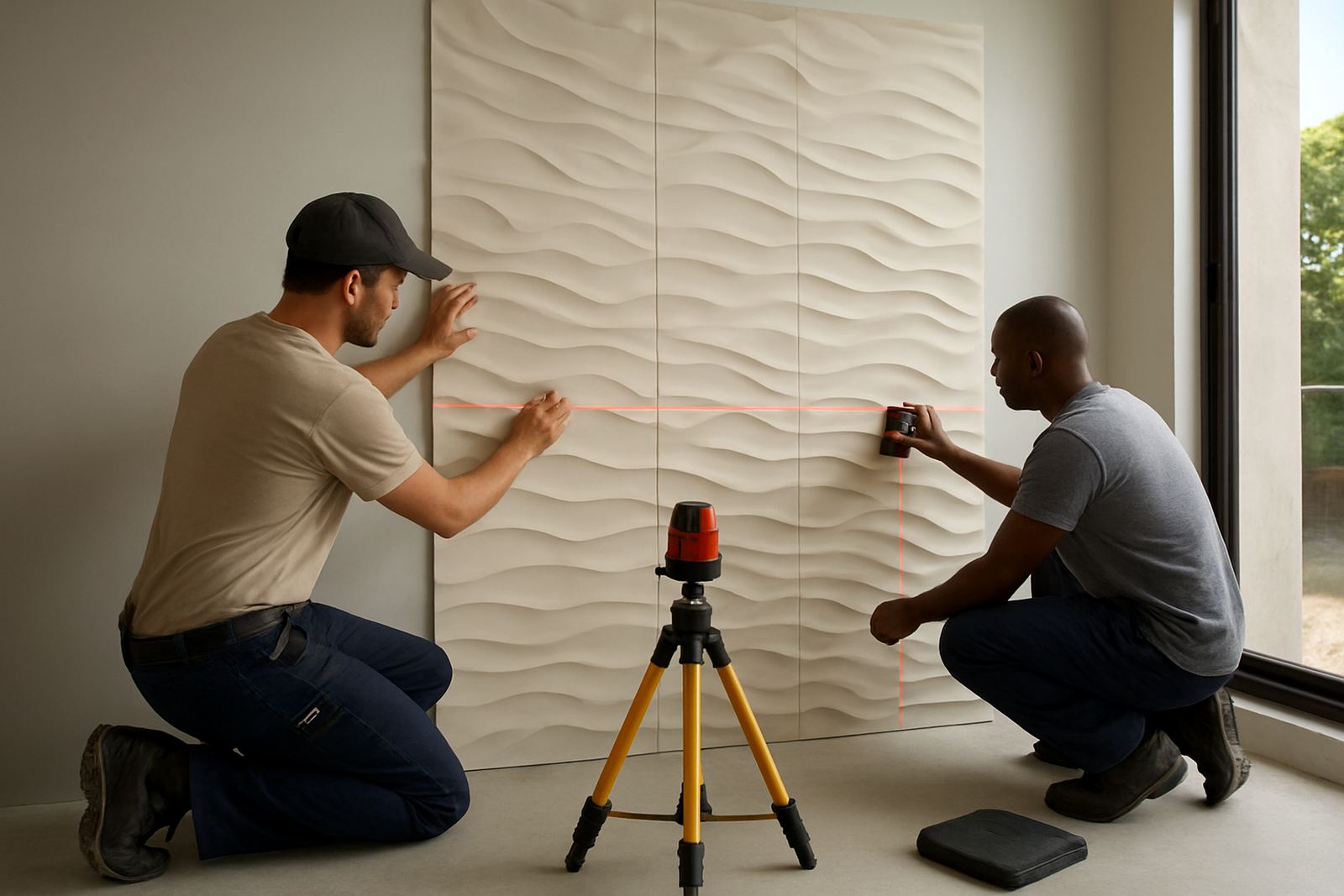
At WallArtDesign, site measure-ups help avoid guesswork. That matters in commercial spaces where even a 20 mm shift can affect alignment across multiple panels, or when a homeowner wants a feature wall behind a headboard and the bed height changes the visual centre.
Colour mistakes that flatten the feature
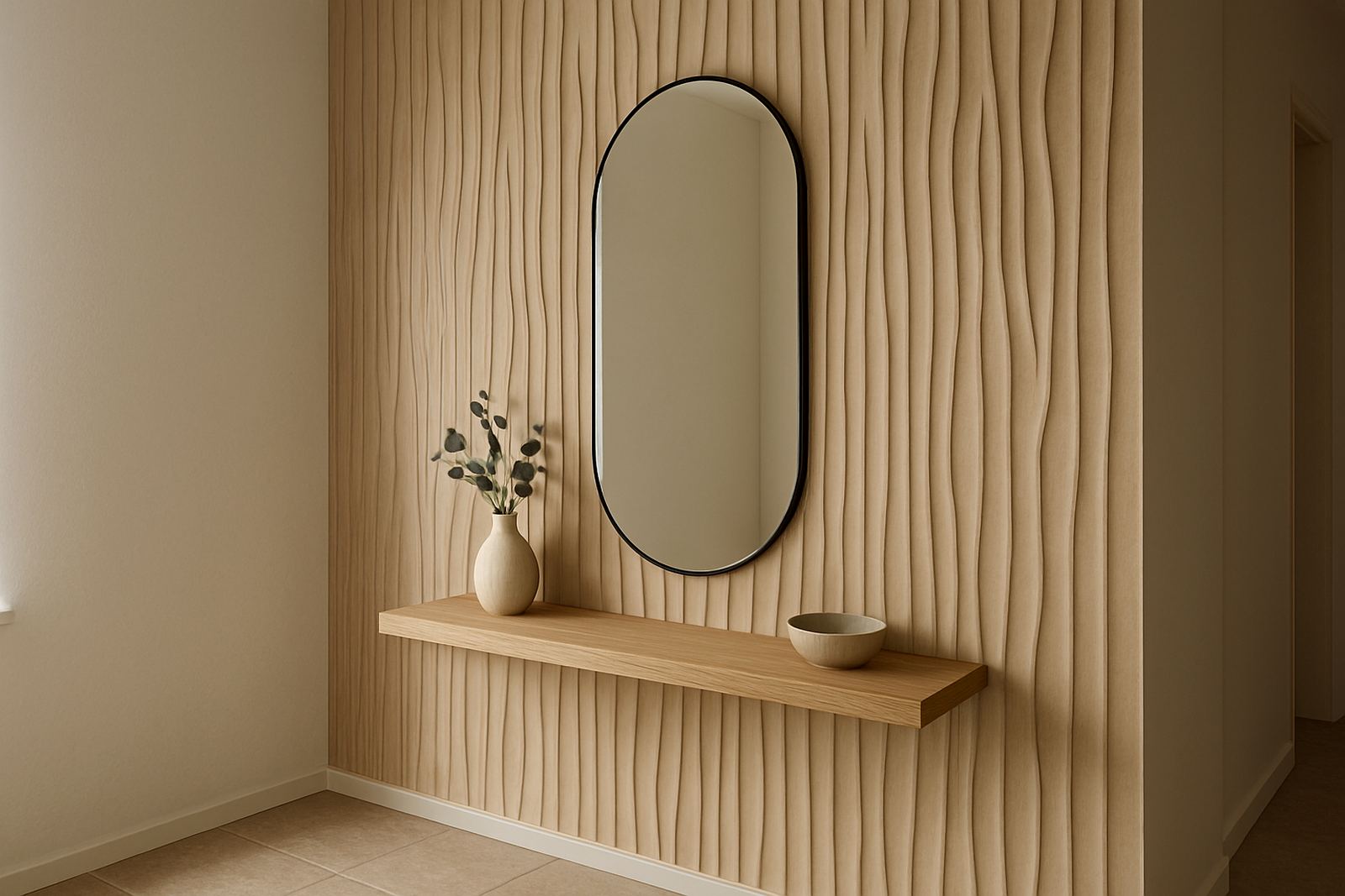
Colour choice can make or break a statement wall. A tone that looks rich in a showroom may read flat in a west-facing room in the Atlantic Seaboard, or too harsh under cool LED lighting in a retail space. Another common problem is matching the wall too closely to everything else in the room, which removes contrast and leaves the feature wall without a clear role.
It helps to think about the time of day the room is used most. Morning light, afternoon glare, and load-shedding conditions can all change how a finish appears. Textured panels usually have more depth than a plain painted wall, but they still need the right colour balance to show their shape. In coastal areas, also consider how humidity and sunlight affect the surrounding finishes over time, because a good wall should still look tidy after a season or two.
Placing the wall where it cannot perform
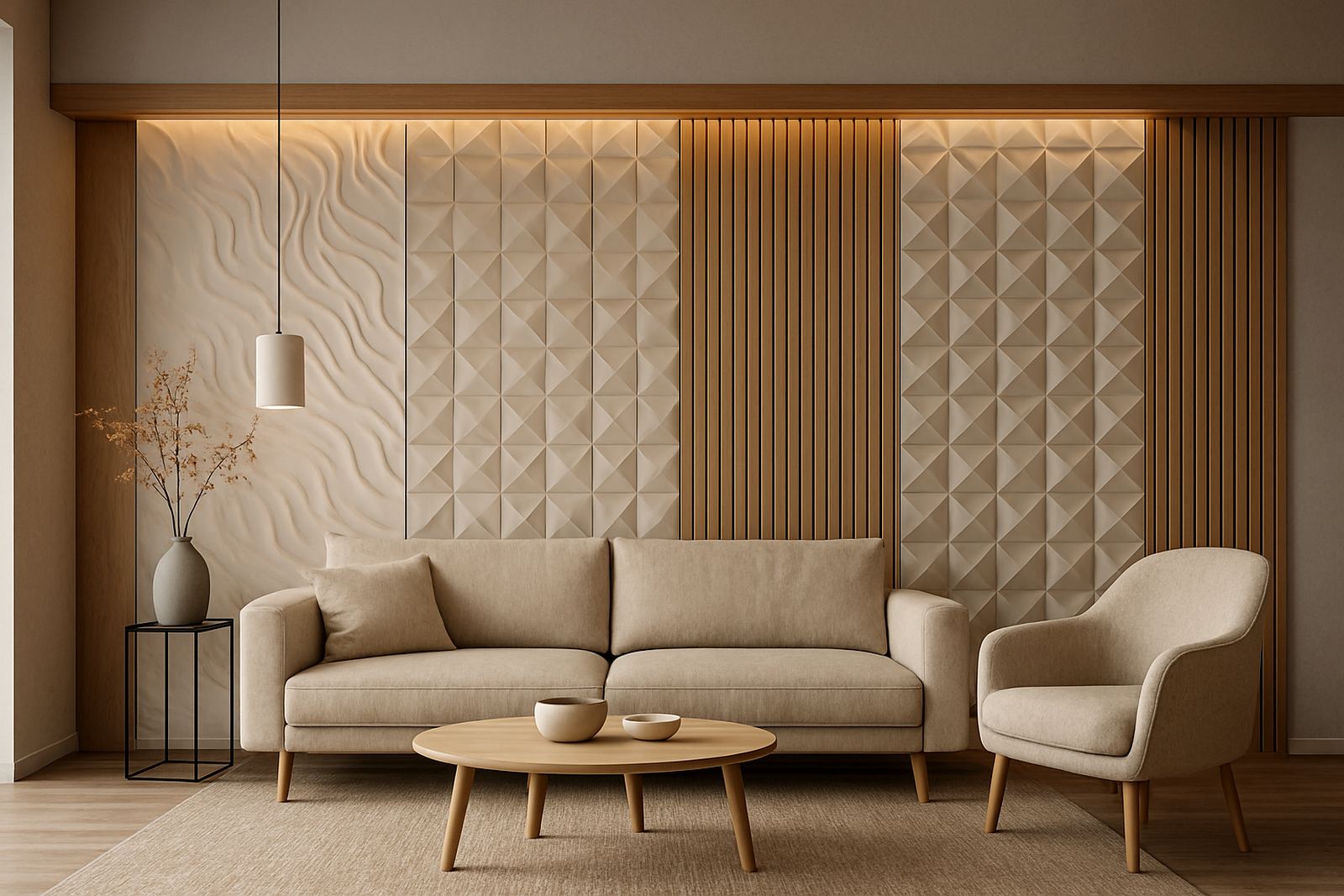
Some walls are chosen simply because they are empty, not because they deserve the spotlight. That is a mistake. A statement wall should support how the room works. In a living room, the wall behind the main seating area may be better than the television wall if the goal is to create a calmer focal point. In an office, a reception wall often does more work than a side wall hidden behind storage.
- Avoid placing a feature wall where furniture will cover most of it.
- Do not choose a wall broken by too many doors or uneven cut-outs unless the design can handle that.
- Keep sight lines in mind from the entrance, not just from inside the room.
- Allow the wall to be seen, not only walked past.
A common example in Cape Town is a Southern Suburbs home where the dining room wall faces a large opening to the kitchen. If the feature is too busy, it competes with movement through the space. A cleaner texture or acoustic panel layout often works better there, and the room feels more settled.
Ignoring the surface below the panels
Even the best-looking panel will struggle on a poor surface. Uneven plaster, damp patches, loose paint and dusty walls can all shorten the life of the installation. In older properties around Stellenbosch and Paarl, wall preparation is often the part that gets rushed, but it is the part that decides how neat the final result looks.
Before installation, the wall should be checked for straightness, moisture and soundness. If the wall is not ready, joints show, edges lift, or the finish looks patchy once the light hits it. In commercial jobs, this also affects maintenance. A panel fitted onto a weak base may need repairs sooner than expected, which interrupts trading hours and adds cost.
Overlooking acoustics and day-to-day use
Many people choose a feature wall for appearance only, then realise later that the room still echoes. In home theatres, meeting rooms and open-plan offices, the wrong finish can leave the space sounding hard and uncomfortable. Acoustic panel fitting can make a practical difference, especially where glass, tile and concrete already reflect sound.
Daily use matters too. A wall near an entrance, child’s play area or busy reception needs a material that can handle regular cleaning and minor knocks. For restaurants and office foyers, we often suggest layouts that are easy to maintain and not too fussy around corners. If a wall is decorative but difficult to live with, it stops being useful very quickly.
A better approach for Western Cape spaces
The safest way to avoid statement wall mistakes is to plan the wall around the room, not the other way around. Start with the size of the wall, the amount of natural light, the furniture layout and the daily use of the space. Then choose the texture, colour and fixing method that suit those conditions.
In Montague Gardens, we often work with architects, designers and homeowners who want a feature wall that looks good on day one and still performs a year later. That might mean a detailed layout for a lounge, a cleaner finish for a boardroom, or a panel repair plan for a busy commercial area. The right choice is usually the one that fits properly and stays practical, not the one that shouts the loudest.
- Book a site measure-up before ordering panels.
- Match the finish to the room’s light and use.
- Check the wall surface and prepare it properly.
- Think about acoustics, cleaning and long-term wear.
When a statement wall is planned with care, it adds something real to the room. It gives the space direction, without taking over.