
Start With What the Wall Must Do
Before you choose a colour, decide what the wall needs to achieve. In a lounge, the aim may be to anchor the seating area and make the room feel complete. In a reception space or boardroom, the wall may need to support branding, guide the eye and still feel calm enough for day to day use.
Feature walls work best when they are solving a room problem, not just adding colour for its own sake. A narrow passage can feel longer with a darker tone at the far end. A large open-plan living area can feel more organised when one wall holds the visual focus. In both homes and commercial interiors, the right colour helps the cladding or 3D panel pattern stand out without fighting the rest of the space.
Match the Colour to the Texture, Not Just the Paint Chart
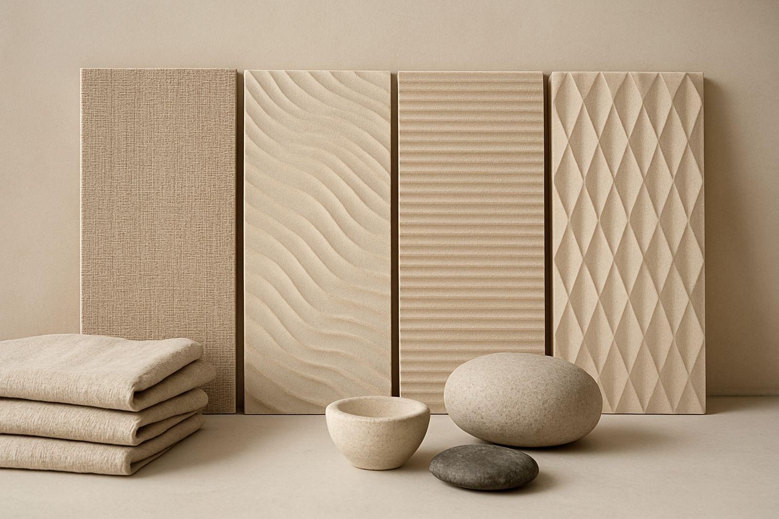
Texture changes how colour behaves. A smooth painted wall reflects light evenly, while a 3D wall panel or cladding profile creates shadows that can deepen the shade by a few tones. That is why a colour sample that looks fine on paper can appear much darker or busier once it is on the wall.
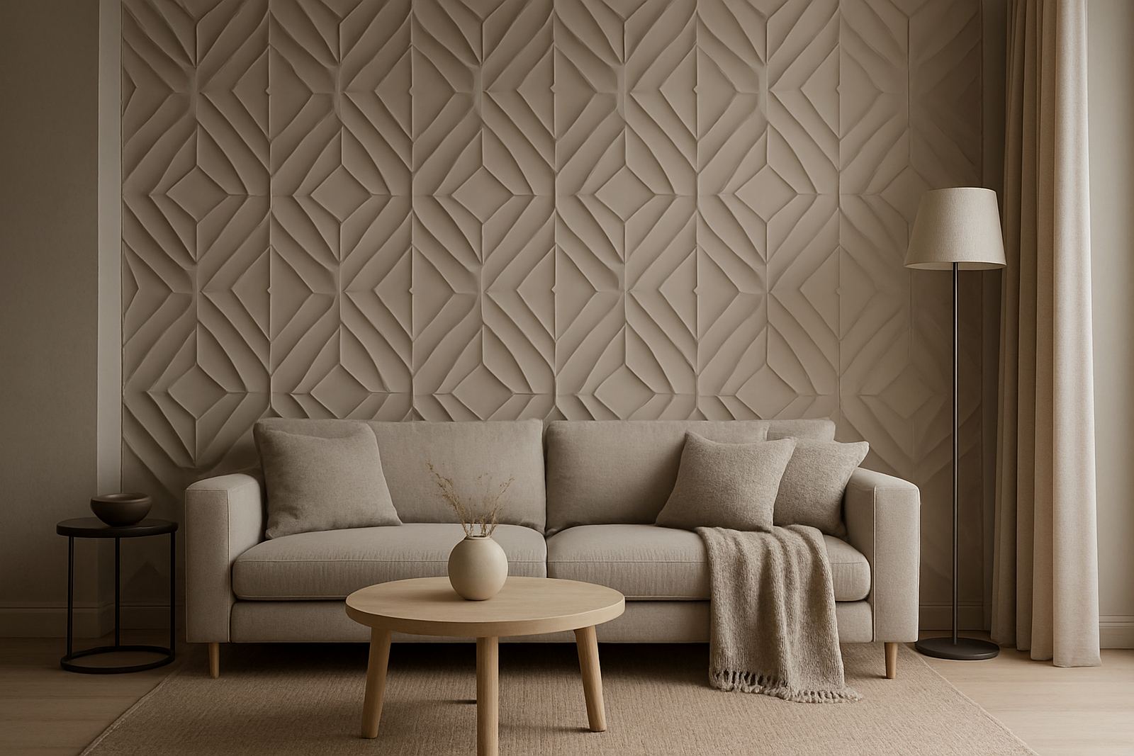
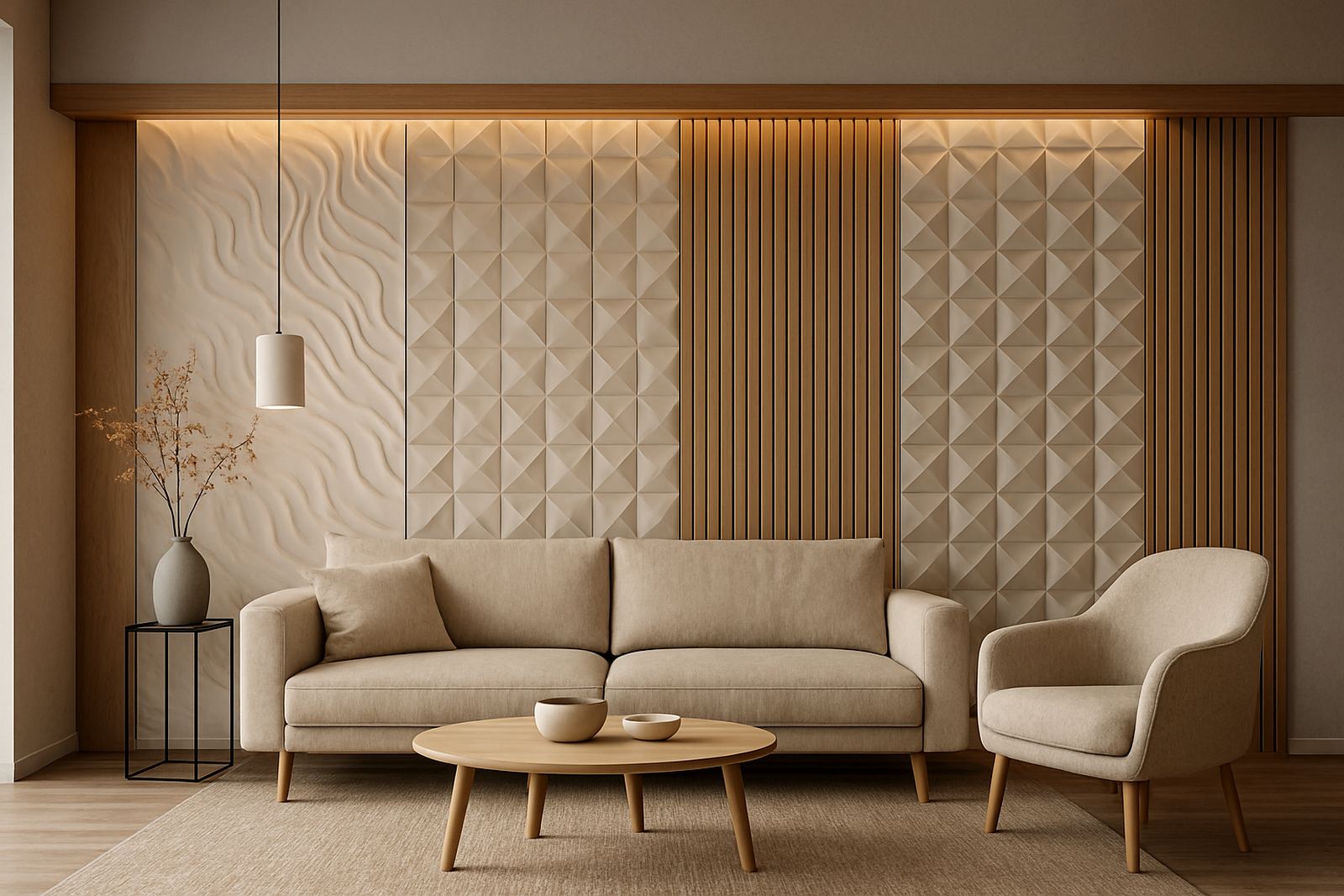
When working with patterned panels, choose a colour that supports the movement in the surface. Soft greys, warm whites and muted earth shades usually let the shape do the talking. Strong colour can still work, but it needs balance. A deep charcoal or rich olive may suit a media wall or study, while a lighter neutral often makes a textured wall feel more refined and less heavy.
- Use lighter colours where natural light is limited.
- Use deeper colours when you want the wall to feel grounded and contained.
- Test colour against the panel texture in both daylight and at night.
- Check the finish under warm and cool lighting before you commit.
Think About Coastal Light and Western Cape Conditions
In Cape Town and the coastal suburbs, colour shifts through the day. Morning light can make a cool grey feel almost blue, while late afternoon sun can warm up beige, taupe and sand tones. In homes near the Atlantic Seaboard, high light levels often call for colours with a bit of depth so the wall does not wash out. In shaded rooms in the Northern Suburbs or Stellenbosch, softer and warmer shades often work better.
Coastal humidity also matters when the wall finish sits near kitchens, entrances or sliding doors. A colour that hides the everyday marks of family life can save time on maintenance, especially in busy households. In a small apartment in Sea Point, for example, a pale mushroom feature wall with a textured panel finish can make the lounge feel larger while still adding interest. In a Paarl family home, a deeper clay tone behind a fireplace can give the room a strong focal point without feeling too hard.
Build the Colour Around the Room Scheme
A feature wall should connect with the rest of the room, not sit apart from it. Look at the sofa fabric, curtain colour, floor tone, cabinetry and existing trims. If the room already has busy patterns, the wall colour should usually be quieter. If the furniture is plain and the room feels flat, the wall can carry more colour or contrast.
Good colour choices often come from one of three directions: tone on tone, contrast, or repetition. Tone on tone uses shades close to the existing palette for a calm result. Contrast creates a stronger statement, such as a dark wall against light walls. Repetition pulls a colour from a rug, scatter cushion or artwork and repeats it on the wall so the room feels intentional.
- Repeat one colour from soft furnishings for a joined-up look.
- Use no more than one strong accent colour in the same room.
- Keep skirting, frames and cornices in mind when planning contrast.
- For offices, align wall colour with the brand palette but keep it practical for daily use.
Use Colour to Support Acoustic Panels and Commercial Spaces
In commercial interiors, colour has to do more than look good. Acoustic panel fitting often works best when the panel colour is chosen with the lighting and the room purpose in mind. A neutral charcoal can reduce glare in a meeting room. A warm mid-tone can make a hospitality space feel more welcoming. For retail fittings and client areas, colour can guide movement and create clear zones without extra signage.
For architects, designers and shopfitters, the right wall colour can also help conceal minor variations that happen in large rollouts. Consistency matters, especially across branches in Stellenbosch, Somerset West and the southern suburbs where light conditions may differ from site to site. Choosing a colour family early in the process makes sample matching much easier and reduces the chance of mismatch between batches or installations.
A Practical Cape Town Example That Gets It Right
A client in Montague Gardens wanted a feature wall for a compact office waiting area. The room had bright daylight from one side and cooler overhead lighting after load-shedding switchover. A very pale colour made the wall look flat, while a dark option felt too closed in. The final choice was a warm greige with a low sheen finish, paired with a panel profile that added shadow without overpowering the space.
That choice did three useful things. It kept the room calm for visitors, worked with the existing floor tiles, and hid scuff marks better than a lighter wall would have. The same approach can work in homes too. The rule is simple: start with the room conditions, then choose the colour that supports them. It saves time and the finish ages better too.
How to Approve a Colour Before Installation
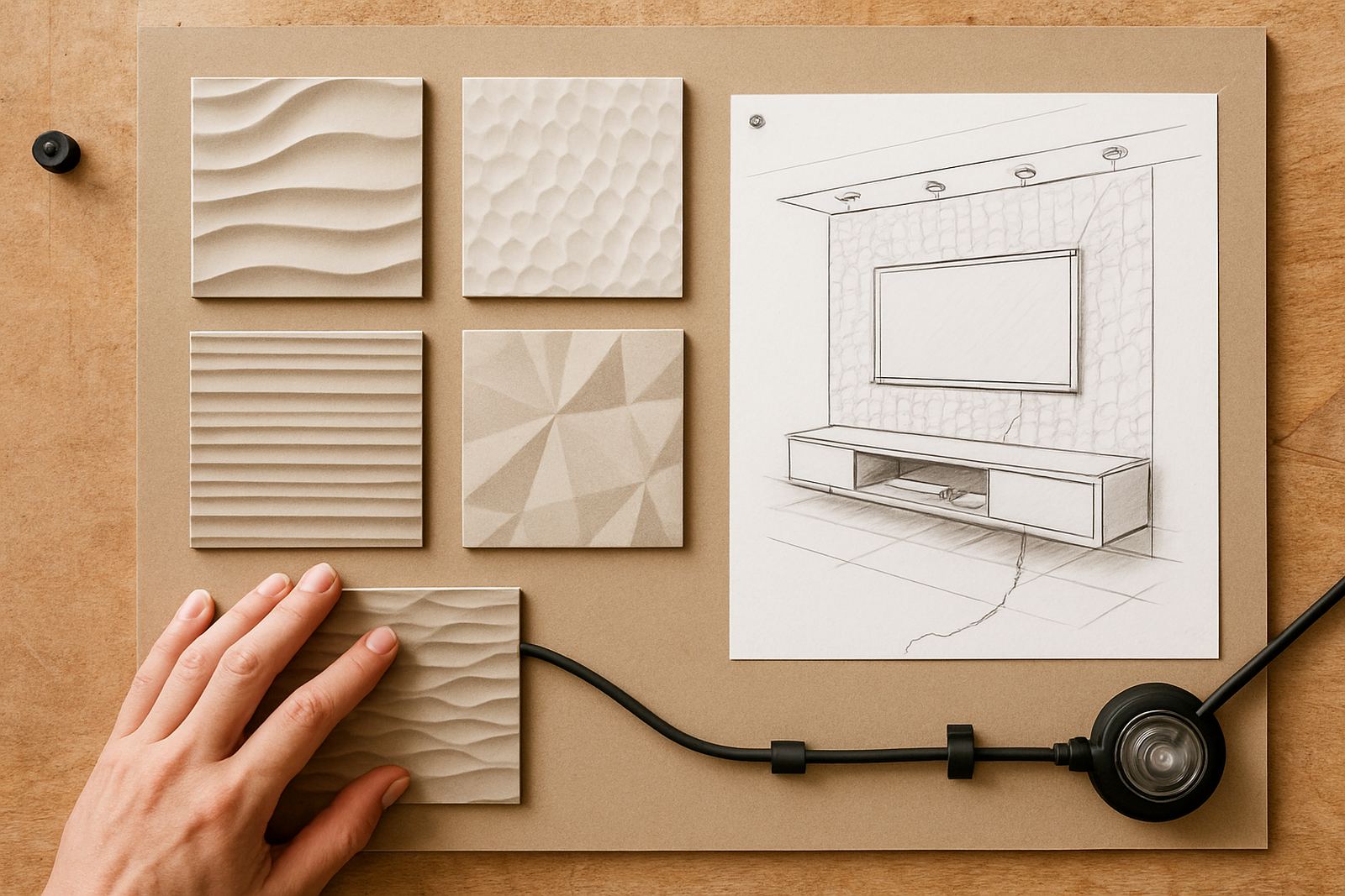
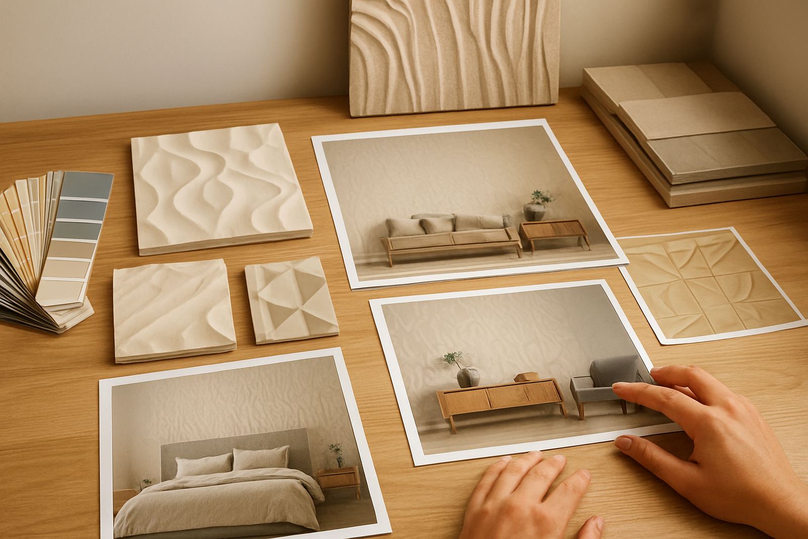
Never approve a feature wall colour from memory alone. Request samples, place them against the wall and look at them at different times of day. Stand back from the room and check how the colour behaves beside furniture, artwork and door frames. If the wall is textured, view the sample at an angle so you can see how the surface catches light.
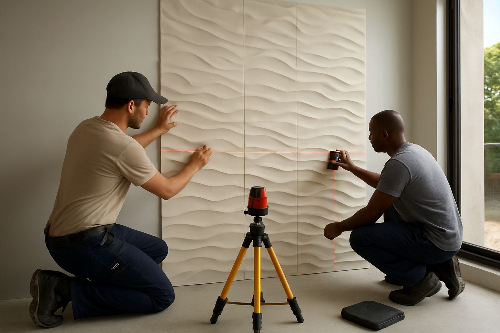
A short site measure-up and sample matching session can prevent costly changes later. It also helps when the wall is being installed in stages or when panels need to be couriered nationwide for a project outside Cape Town. Once the colour is signed off, the installation team can prepare the wall properly, set out the layout and finish the feature wall with fewer surprises. A careful approval process is not flashy, but it works.
- Check samples in daylight and after dark.
- View them next to the actual floor and furniture.
- Confirm the finish with the texture you plan to install.
- Keep a spare sample for future maintenance and repairs.